Our 2015 emergence as Atmosphere Commercial Interiors was fast, exciting, and sometimes daunting. But we have been in business for 40, 60, and nearly 100 years—depending on which office you’re standing in. We’ve been Dayton’s Commercial Interiors, Rowley-Schlimgen, Walsh Bros, USBI, Prange Business Interiors, and Target Commercial Interiors. And because of our rich and diverse heritage, our company is dynamic and adaptable.
We accomplished a successful rebrand in under three months. Here’s how.
Step 1—Define the Brand
Our journey from Target Commercial Interiors to Atmosphere Commercial Interiors began in earnest weeks before the announcement of the Target sale in May 2015. But in some ways, we’d begun the work a year before in 2014.
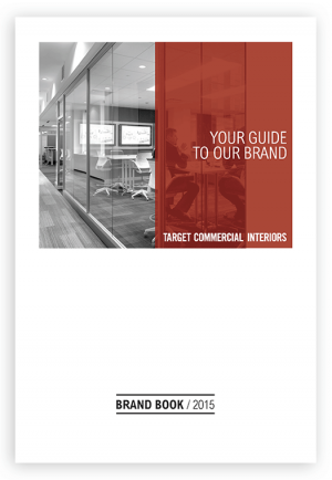
Throughout 2014 and into early 2015, we had just wrapped up a Brand and Value Proposition exercise that resulted in a comprehensive Brand Book. In other words, we were very clear about who we were.
 However, even with that new self-awareness, we learned a thing or two about ourselves when facing a full rebrand. We needed a new name, logo, colors, and talking points. Fast.
So, prior to the sale announcement, a small internal team started working with a branding consultant to help guide us through the process. Combining our vision of the future and all its new possibilities with our heritage, culture, and innate brand, we dove into New Brand Development with enthusiasm.

In late April 2015, still four weeks away from announcing the sale, we had to keep our planning process top secret. The branding firm was quickly getting up to speed, and the leadership team pulled together to make sure that everyone was available for video conferences, review and immersion sessions and provided good, actionable feedback fast, because the sale date and the need to replace the Target name was getting closer and closer.
Step 2—Get Client Feedback
Dilemma. The Target sale and rebrand had to be accomplished in secret. Thankfully, the branding firm brought a wealth of experience that provided the needed objective insights that paired well with our established client feedback data.
The branding firm talked to us about who we thought we were. Who our clients and competitors thought we were. What did we want to accomplish with a new name? Did we understand that names and logos are byproducts of a culture? They toured our spaces. Used their proprietary methods and arrived at not only a list of potential names, but something even more important and exciting – they recognized that we already had a VERY strong culture. Not one that was dependent on Target or the color red. One that spoke to how we all care about each other, our clients and the quality of work we do.

Step 3—Discover What Doesn’t Work
From here, the process moved quickly. We eliminated the options that we could never imagine being a part of, an initial list of about 200 names. We whittled that down to 30 names.
The branding firm focused on key types of names like aspirational, fun and literal. Through an elimination process, we came down to the final four. Blend. FIT. Studio Blue. And Atmosphere. Believe me, there were many spirited discussions around the pros and cons for each!
Blend – we do it all the time. We blend products. We blend materials. We blend cultures with our clients. But how easy is it for our competitors to seize the opportunity to call us BLAND? No, that won’t do.
FIT. Depends on how you see that word. Could be too trendy. FITness. FITbit. But it also talks about what we do. We help our clients find a fit in their new space. With their new products. But it was just too trendy and short. FIT wasn’t fit to be our name.
Enter the final 2 – Studio Blue and Atmosphere. Studio Blue had a lot of support. It sounded fresh. It was a nod to a color that wasn’t red. It had a lot of potential. But it sounded like the name of an A&D firm. Because we partner with A&D firms, we did not want to add an element of confusion about our identity.
Atmosphere. We all agreed that there was really only one choice to represent who we are and who we’ve always been.
It felt right. It’s what we do. We create an atmosphere for our clients, not just a place with stuff in it. That’s not about selling furniture, that’s about us. And that’s why every client we talked to in the early days of the sale said “We don’t care which name is on the door, we stick with YOU!”
Step 4—Create the Story
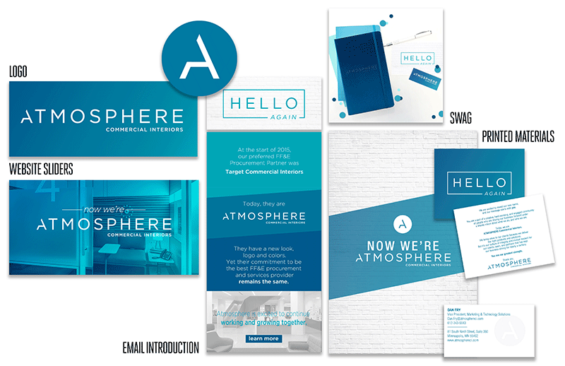
Some form of blue was always what the group gravitated towards. But royal blue makes you think of Best Buy or Wal-Mart. A flatter blue makes you think of Steelcase. The idea of the gradient was proposed by the branding firm, and after several iterations from the Marketing team, we arrived at the base blue and bluish gradient you’ve all seen. It’s calm. It’s fresh. It moves.
![]()
And it gives us so many ways to work with the color and the logo in different applications, so that it stays fresh and interesting.

We also wanted an element that would transfer well from the word to a standalone mark. The branding firm gave us guidance on using what they call a “trick” letter, and we found our “A”. And if you really squint your eyes, you could say that it kind of looks like a chair, right? We just liked it. It was distinct, and cool!

Step 5—Share the Story
Written down it all seems pretty simple. It wasn’t. It was fun, scary, frustrating and liberating. And more than anything, we couldn’t wait to get the new name out to our teams and our clients.

Step 6—Live the Story
We are thrilled to have a name and brand that truly represents who we are. Take it from our team members!
“As we converse with clients about their own changing organizations, it helps to remember our own process and how it felt to live inside the change. Knowing how we got there is a great part of our story.”
~ Karen
“It was a journey, and I am very happy with our new name. The more I see it and how it can be creatively used, the more I like it!”
~ Melissa
“Personally, took me a little bit of time to become comfortable with the new name. However, the more that I explored the logo, the gradient, the blue, the font- the more excited that I became with the ways that we would make Atmosphere our own! It’s bright, airy, beautiful. We all embrace change differently and I thank you all who have shared the joy and excitement of our new name with such short notice!”~ Natasha
“Stepping away from one of the world’s most recognizable brands was daunting, but it was very inspiring to have the chance to let our own culture and brand shine through.”
~ Megan
“I think it is a great name with lots of possibility for the future. Now it is up to the team to grab those possibilities!”
~ RaeLyn
“We appreciate that time was taken to choose the right name. What is amazing to all of us is the execution of excellence and speed — Thanks everyone for a great new name and onward to greater things!”
~ Jill


